Norddjurs Biblioteker
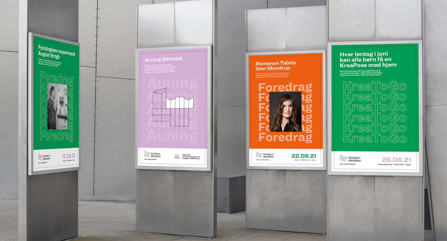
The idea for the logo emerged from particular window frames at four libraries on various locations – designed together as a special trademark. The unique form is used for bookmarks, special icons, screen design etc. Typography becomes a graphical element representing knowledge and repetition, as a symbol of the learning experience in libraries. A bold choice of purple, green and orange constitutes the colourful visuals of the brand.

Client: Norddjurs Biblioteker
Disciplines: Art Direction, Strategy, Workshop, Design, Logo, Signage
Awards: International Visual Identity Awards 2021 Gold Winner


